


Choosing the right color in a room can give another aesthetic: To create a warm atmosphere, to ensure the required harmony with your objects and furniture and to improve your mood! Therefore, the choice should not be made by chance. Through the color palette you can see the various options, get ideas and choose the one that suits you.
Before making your final choice, you should consider what the cold colors are and what the warm colors are, as well as the shades and brightness of the colors, the correlations and their importance.
Before making your final choice, you should consider what the cold colors are and what the warm colors are, as well as the shades and brightness of the colors, the correlations and their importance.
Warm and cool colors
Choose the shades that suit you and choose cool colors such as green and blue or warm such as red, orange and yellow depending on whether you want peace or warmth in your space. For greater convenience, you can consult the color wheel in which all their shades and correlations stand out.
Shades - Color correlations
To choose the right shade, first determine the color you want. Intense colors like red and green or softer like beige? Next, select the appropriate shade for your original selection. Think about how much each shade fits and how well it highlights your space and come up with the most suitable one.
Finally, choose the degree of intensity that will determine its brightness.
Remember that rooms overlooking the south are more sunny and match deeper tones of shade. Then, the northern rooms require brighter shades.
Read here which colors can give the feeling that your room is bigger and how you can match the colors with each other.
Significance of colors
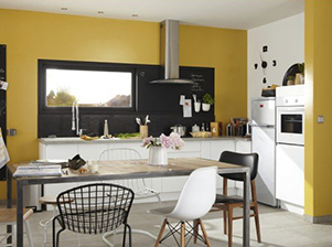
Yellow:
The choice of colors reflects our personality and determines the sense of space. Here are some features that apply to some basic colors in order to choose the right one.

color synonymous with sun, light, joy and liveliness. Its brightness causes a rejuvenation and toning. It is best to avoid children's rooms on large surfaces because it causes confusion. Ocher is one of the most common shades of yellow and goes well with the living room and kitchen. Coffee:

Orange: one Red: One of the warmest colors, it gives joy, works as an antidepressant and offers joy. These are the main reasons why many people choose orange to heat their kitchen or living room.

color that causes reliability, safety and security. It has relaxing properties and is recommended for living rooms and bedrooms.

color synonymous with action, energy, determination, love and passion. The lighter shades make the atmosphere more intimate. Ideal for dining rooms or kitchens as it whets the appetite. Combine it with blue or green to sweeten the final performance.
 Pink:symbolizes tenderness, romance, care, kindness and unconditional love. That is why it is the first color in parents' preferences for a children's girl's room. Matching it with white furniture and decorations in yellow and green shades will give a sweetness and at the same time a pleasant intensity in the children's room.
 Purple: symbolizes spirituality, nobility, inspiration and kingdom. It is best to avoid large amounts because purple can cause melancholy. In smaller doses, however, it acts as a stimulant of inspiration and creation. That's why moms prefer it for girls' bedrooms, but also for the living room.
 Blue:color synonymous with purity, peace and tranquility. It has soothing properties and in light shades it is ideal for the children's boys' room and for the bathroom. It is good to know that blue suppresses appetite. Finally, it is best to avoid blue in brightly lit areas.
 Green:color synonymous with freshness and nature. Identified with beneficial properties as it stimulates the mood, soothes and helps concentration. It matches most colors and does not bind you with the shades of your objects and furniture. Ideal for workplaces and rooms we read.
 Remember that ceilings are part of our horizon and it is best to paint in softer shades than the basic color of the walls to have a continuity in the visual field. In case your ceiling is too high and you want to give the opposite feeling, you can use a darker color on the ceiling.